A Guide to E-commerce Website Designing That Converts
By Boost Team
When we talk about designing an e-commerce website, we're really talking about the whole shebang: planning, creating, and launching an online store that actually works for the customer. It's a deep dive into user experience, keeping your brand looking sharp, and, most importantly, turning visitors into buyers.
It’s everything from the big-picture strategy and early wireframes to the final visual polish, product page layouts, and a checkout process that’s smooth as butter. Let’s be clear: effective design isn’t just about making things look pretty. It’s about building a strategic machine that drives revenue.
Building a Strategic Foundation for Online Sales
So many people make the mistake of jumping straight into choosing colours and fonts. I've seen it time and again. The result? A beautiful site that doesn’t sell a thing—basically an expensive digital brochure. The truth is, the most successful online stores are built on a rock-solid strategic foundation, where every single design choice is deliberate and aimed squarely at growth.
Before a single pixel is placed, you have to get brutally honest about who you're selling to, what you're trying to achieve, and where you stand in the market. Nailing this groundwork ensures your design doesn't just look good, but connects with the right people and is engineered to hit business targets from day one.
Define Your Ideal Customer
You can't design an effective store if you have no idea who you're designing it for. And I mean really know them. Moving beyond basic demographics like age and location is a must. You need to get inside their heads and understand the why behind their purchases. What makes them tick? What problem are they hoping your products will solve?
This is where creating detailed customer personas comes in. These aren't just fluffy exercises; they are practical tools. Give these fictional characters names, jobs, and backstories.
- Pain Points: What frustrates them when they shop online right now? Maybe they can’t find sustainable products, or they’re just swamped with too many confusing options.
- Shopping Habits: Are they scrolling on their phones during the morning commute or sitting down at a desktop for some serious research? Do they trust an influencer's recommendation over a hundred detailed customer reviews?
- Goals and Aspirations: Think bigger. A customer buying new running shoes isn't just buying footwear; they're buying progress towards a fitness goal, a feeling of accomplishment.
Getting a handle on these details lets you tailor every part of the user experience, from the message on your homepage to the products you recommend.
This diagram shows how these initial strategic steps flow into one another, creating a solid base for your design.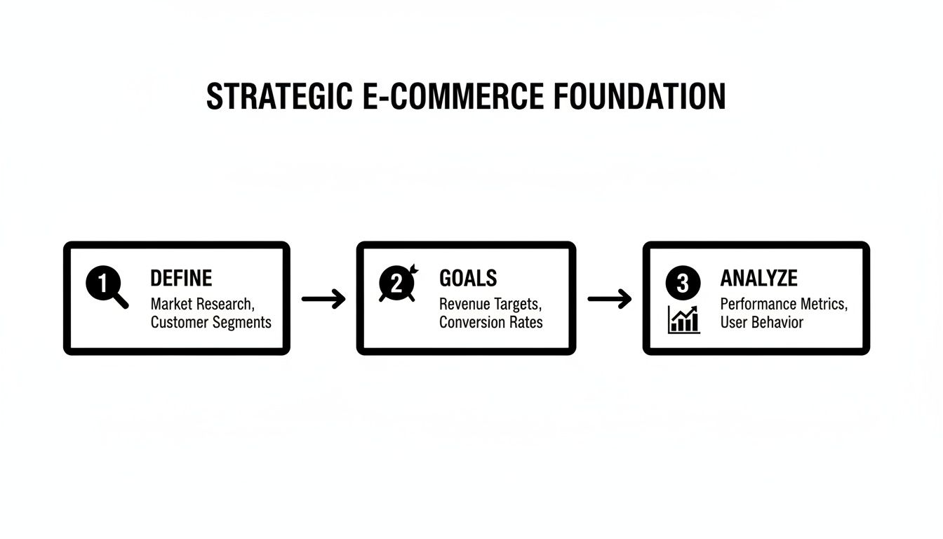
As you can see, the path from defining your audience to setting goals and analysing the competition ensures every decision you make is informed and purposeful.
Set Measurable Business Goals
Your website needs a job description. "Make more sales" is a wish, not a goal. You need specific, measurable targets to guide your design choices and, later, to know if you've actually succeeded.
Think of your e-commerce website not as just a storefront, but as your most powerful sales and marketing engine. Every goal you set should be a Key Performance Indicator (KPI) that measures how well that engine is running.
Here are a few of the most critical KPIs you should be focused on:
- Conversion Rate: What percentage of visitors do you need to complete a purchase? A good starting point is to aim for a 3% conversion rate.
- Average Order Value (AOV): How much, on average, should a customer spend in one go? Maybe your goal is to increase this by 15% through clever upselling.
- Customer Lifetime Value (CLV): How much revenue can you expect from one customer over the long haul? This number will directly influence your thinking around loyalty programmes and email marketing.
These goals have a direct impact on design. For instance, if increasing AOV is a priority, you'll want to design prominent "Frequently Bought Together" sections on your product pages. If you're looking for more guidance on this, our insights on https://www.marketwithboost.com/insights/digital-marketing-for-ecommerce can help you align your efforts.
The South African market provides a pretty compelling reason to get this right. In 2023, South Africa's e-commerce market hit a record USD 4.065 billion (R71 billion)—that's a massive 29% jump from 2022. This kind of explosive growth tells you just how critical a well-designed website is for grabbing your piece of a booming digital economy.
Analyse Your Competitors
Finally, it's time to do some snooping. Take a good, hard look at your competition. This isn't about copying what they do; it's about learning from their wins and their mistakes to find your unique angle. Pick 3-5 direct competitors and put their websites under the microscope. For anyone just starting out, a solid guide on how to set up an e-commerce website can offer a great foundational checklist.
As you analyse, ask yourself these questions:
- What are they absolutely nailing? (Think great product photography or a super simple checkout.)
- Where are they dropping the ball? (Maybe their pages are slow to load, or the navigation is a mess.)
- What is their unique selling proposition (USP)? How are they positioning themselves in the market?
- Most importantly, how can you differentiate your brand and offer a better, more memorable experience?
This analysis will shine a light on gaps in the market and opportunities for you to stand out. Perhaps your competitors all feel a bit corporate and lack personality, or their mobile experience is clunky and frustrating. These are the weak spots where superior design can give you a serious competitive edge.
Crafting an Effortless Shopping Experience
Alright, with your strategy locked in, it's time for the fun part: bringing your online store to life. This is where your business plan meets the customer’s first impression. The real magic in brilliant e-commerce website designing happens when two critical concepts, User Experience (UX) and User Interface (UI), work together in perfect harmony.
Think of it like building a house. UX is the architectural blueprint. It dictates where the rooms go, how you move from the kitchen to the living room, and ensures the whole layout just makes sense. UI, on the other hand, is the interior decorating—the paint colours, the furniture, the lighting. You need both a solid blueprint and beautiful decor to create a home people want to live in. Your site is no different.
The Blueprint: User Experience (UX) Design
Good UX is invisible. When it’s done well, customers don’t even notice it; they just feel like finding and buying products is effortless. The goal here is to remove friction and make the shopping journey as smooth as possible. A confusing website is one of the fastest ways to lose a sale—a staggering 88% of online shoppers say they wouldn't return to a site after a bad user experience.
Your focus should be on logic and intuition.
- Logical Site Structure: How are your products organised? A customer looking for men's running shoes shouldn't have to click through five confusing menus to find them. Think like a shopkeeper and create clear, logical categories and subcategories that mirror how someone would naturally browse.
- Intuitive Navigation: Your main menu is your customer's map. Keep it clean, uncluttered, and use simple language. Avoid clever or vague terms; "Men's Footwear" is always better than "Stride in Style."
- A Search Bar That Actually Works: A powerful search function is non-negotiable. It needs to offer autocomplete suggestions, handle typos gracefully, and allow for filtering results by size, colour, price, or brand. If a customer searches for a product you sell and gets zero results, you’ve likely lost them for good.
A great user experience doesn't just happen by chance. It's the result of deeply understanding your customer's journey and designing a path of least resistance from the homepage to the 'Thank You' page.
For example, a store selling skincare products could organise its navigation by concern (acne, anti-ageing, hydration) rather than just by product type (cleansers, serums). This simple UX choice directly addresses the customer's "why," making it far easier for them to discover the right products.
The Visuals: User Interface (UI) Design
If UX is the solid structure, UI is the personality. It’s the visual layer that builds trust, communicates your brand’s character, and makes the shopping experience genuinely enjoyable. Great UI isn’t just about looking pretty; it’s about creating a visual language that guides the user and reinforces your brand identity at every turn.
To get a clearer picture of how these two work together, let's break it down. While they are deeply connected, their core focus is different.
Key UX vs UI Elements in E-commerce Design
| Element | UX Focus (The Journey) | UI Focus (The Look and Feel) |
|---|---|---|
| Navigation Menu | Is it easy to find products? Is the structure logical? | Are the fonts readable? Does the menu's colour scheme match the brand? |
| Product Discovery | How quickly can users filter and sort to find what they need? | Are product images high-quality? Is the layout visually appealing and uncluttered? |
| Call-to-Action Buttons | Is it clear what happens when a button is clicked? Is it placed in a logical spot? | Does the button's colour stand out? Is the text compelling (e.g., "Add to Basket")? |
| Overall Layout | Does the page guide the user's eye naturally towards a purchase? | Is there enough white space? Do the visual elements create a cohesive, professional look? |
As you can see, you can't have one without the other. A logical flow with a terrible look will feel unprofessional, while a beautiful site that's a nightmare to use is just frustrating.
Getting the UI right means sweating the small stuff.
- Visual Consistency: Your colours, fonts, and button styles must be consistent across every single page. This consistency builds a sense of professionalism and reliability.
- High-Quality Imagery: Grainy, low-resolution product photos scream "untrustworthy." Invest in professional photography or high-quality mockups that show your products in their best light.
- Readability: Choose fonts that are easy to read on both desktop and mobile screens. Body text should be large enough, with sufficient contrast against the background to avoid eye strain.
- Clickable Cues: Buttons and links need to look clickable. This is often achieved through colour, underlining, or subtle shadow effects. Users shouldn't have to guess where to click next.
Ultimately, UX and UI are two sides of the same coin. A beautiful site that’s impossible to navigate will fail, just as a logically structured but visually unappealing site will struggle to build trust. Nailing your e-commerce website designing means mastering both to create an experience that feels as good as it looks.
Designing Product Pages That Actually Sell
If your homepage is the front door, your product pages are your best salespeople working the floor. This is where the magic happens—or doesn't. A shopper has shown interest and clicked through; now, it's this page's job to seal the deal by building trust, answering every unspoken question, and making the desire to buy overwhelming.
Every single element has to work in concert, from the photos right down to the text on the "Add to Cart" button. Think of it this way: for every unanswered question or moment of friction, you’re giving a customer a reason to bounce. Our mission is to make that click to buy feel like the most natural, obvious next step they could possibly take.
Writing Descriptions That Connect and Convert
Your product description is so much more than a list of specs. It’s your pitch. It’s your chance to tell a story that resonates with your customer’s real-world needs. While you absolutely have to include the technical details, the real work is in translating those features into tangible benefits.
For instance, don't just state that a backpack has "water-resistant nylon." That's flat. Instead, try something like, "Built with durable, water-resistant nylon to keep your laptop and valuables safe and dry during an unexpected downpour." See the difference? One is a fact; the other paints a picture and solves a real problem.
To get your descriptions working harder for you, zero in on these areas:
- Emphasise Benefits Over Features: Always answer the "what's in it for me?" question for your customer.
- Use Your Customer's Language: Dig into reviews and customer feedback. Weaving their own words into your copy makes it feel authentic and instantly relatable.
- Optimise for SEO: Naturally work in the keywords people are actually searching for. This helps your products show up when it matters most.
- Keep It Scannable: No one wants to read a wall of text. Use short paragraphs, bullet points, and bold text to make your key points pop.
The Power of Visuals and Social Proof
People shop with their eyes, especially online. Since they can't physically pick up or try out your product, your visuals have to do all the heavy lifting. This is absolutely not the place to be cutting corners.
High-resolution images from every conceivable angle are the bare minimum. Show the product in a real-life context, use close-ups to highlight premium details, and seriously consider adding a short video. A video demonstrating the product can be a game-changer; some studies show viewers are 64-85% more likely to buy after watching one.
But it’s not just about showing the product; you need to show that other people love it, too. This is where social proof becomes your most powerful asset.
Customer reviews are the new word-of-mouth, and they are incredibly persuasive. A page brimming with genuine, positive feedback can often do more selling than the most perfectly crafted marketing copy.
Make a point to actively encourage reviews and display them prominently. Featuring user-generated content, like photos from customers using your product, adds a layer of authenticity that marketing departments can only dream of. It builds massive trust.
Creating Urgency and Boosting Order Value
Once you’ve built that desire and trust, a few well-placed nudges can make a huge difference to your conversion rate and average order value. When used honestly, these tactics create a sense of immediacy that encourages shoppers to act now instead of "later."
Here are a few proven strategies to consider:
- Limited Stock Alerts: Simple messages like "Only 3 left in stock!" can trigger a fear of missing out (FOMO) and push a hesitant buyer over the line.
- Countdown Timers: For a flash sale or special offer, a visible timer counting down ("Offer ends in 02:15:43") creates a firm, unmissable deadline.
- Related Product Suggestions: Sections like "Frequently Bought Together" or "You Might Also Like" are brilliant, low-effort ways to increase the value of each cart.
By weaving these elements into your product pages, you move beyond just selling a product and start engineering a high-performance conversion machine. For a deeper look at this, check out our guide on 10 proven e-commerce conversion rate optimization tips to really fine-tune your approach. The goal is a seamless experience that anticipates what customers need and guides them confidently toward purchase.
Optimising for Mobile Shoppers and Site Speed
Let's get one thing straight right away: your mobile site isn’t just a shrunken-down version of your desktop website. For a huge portion of your customers, your mobile site is your main storefront. Treating it as an afterthought is one of the most expensive mistakes you can make in e-commerce website designing.
Adopting a "mobile-first" mindset isn't a trend anymore; it's a basic requirement for survival. This means you design the mobile experience first, then scale it up for larger screens—not the other way around.
Why? Because that’s where your customers are. Mobile commerce is the dominant force in South Africa's e-commerce scene, with a staggering 77% of South Africans now shopping online only on their mobile devices as of early 2025. That statistic alone should completely reshape how you approach your design. You can find more detail on this in Netcash’s report on South Africa's e-commerce payment statistics.
This reality demands a laser focus on responsive design, making sure your store looks great and works perfectly on any device, from the smallest smartphone to the widest desktop monitor.
Building a Thumb-Friendly Experience
Picture someone browsing your site on their phone. They’re probably holding it with one hand, using just their thumb to get around. This is a critical detail. Every clickable element—buttons, links, menu items—needs to be designed for thumbs.
This means making your buttons big enough to be tapped easily, without the user accidentally hitting something else. It also means putting key navigation elements, like the cart icon or search bar, inside the "thumb zone"—that comfortable arc where a thumb can naturally reach without stretching.
A seamless mobile experience is all about removing friction. If a customer has to pinch, zoom, and struggle to hit a tiny button, you've already made the buying process feel like work.
Think about how you use your own phone. You expect it to be intuitive. Your e-commerce store needs to deliver that same effortless feeling.
The Need for Speed
In e-commerce, speed is money. Seriously. A slow-loading page is the fastest way to lose a sale before you’ve even had a chance to show them your products.
How much does it matter? Research has consistently shown that a mere one-second delay in page load time can cause a 7% drop in conversions. That’s a massive loss in potential revenue, all from something that is entirely within your control.
Your site’s performance has a direct impact on sales, customer trust, and even your search engine rankings. A fast, snappy website feels professional and secure. A slow, clunky one feels amateurish and untrustworthy. Luckily, there are plenty of practical things you can do to make your site lightning-fast.
Practical Steps to Boost Your Site Speed
Improving your site's performance doesn't have to mean a complete rebuild. Often, a few targeted optimisations can make a world of difference. Here are the most effective tactics I’ve seen work time and time again:
Compress Your Images: Large, unoptimised images are the number one killer of site speed. Use a tool like TinyPNG or ImageOptim to slash file sizes without any noticeable loss in quality. It’s a simple fix with a huge payoff.
Leverage Browser Caching: This tells a visitor's browser to save parts of your site (like your logo and style sheets) on their device. When they come back, their browser doesn't have to reload everything from scratch, making their next visit feel almost instant.
Minify Your Code: This process strips out all the unnecessary characters from your site's code—things like extra spaces and comments that browsers don't need. It makes the files smaller and faster to download.
By focusing on these key areas, you ensure your site loads quickly, creating a better experience for mobile shoppers and boosting your search rankings. For a deeper dive into how performance connects to visibility, our guide on SEO best practices for your online store has some invaluable insights.
Ultimately, a fast, mobile-friendly site is the foundation of any successful modern e-commerce business.
Fine-Tuning Your Checkout and Nailing the Launch

You’ve put in the hard yards. You’ve mapped out a solid strategy, designed a beautiful user experience, and built product pages that truly sell. Now you’re at the finish line—the checkout. This is the moment of truth where a casual browser becomes a paying customer, and even the slightest friction can send them running.
Think of your checkout not just as a form, but as the final, crucial handshake. It has to feel simple, reassuring, and completely trustworthy. A clunky or confusing checkout is one of the biggest conversion killers in e-commerce website designing, period.
Designing a Checkout That Just Works
The golden rule here is simple: make it as easy as possible for people to give you their money. Every extra field they have to fill out, every unnecessary click, adds another reason for them to get distracted and leave. The average cart abandonment rate is a staggering 70%. That means for every ten shoppers who add an item to their cart, seven walk away empty-handed.
Your checkout isn't just a transaction point; it's the final stage of the customer experience. A smooth, secure process builds lasting trust, while a frustrating one can damage your brand's reputation for good.
Here are the non-negotiables for a checkout that converts:
- Offer a Guest Checkout: Forcing people to create an account is a massive barrier. A first-time buyer probably isn’t ready for that commitment. Always make the guest checkout option loud and clear.
- Keep Forms Minimal: Only ask for what you absolutely need to fulfil the order. Do you really need a phone number? Can the billing and shipping addresses be the same by default? Each field you remove can nudge your conversion rate up.
- Show a Progress Bar: Let customers know exactly where they are in the process (e.g., Shipping > Payment > Confirmation). It manages expectations and makes a multi-step form feel less intimidating.
- Provide Multiple Payment Options: Don’t assume everyone uses a credit card. Offer popular alternatives like PayPal, Apple Pay, Google Pay, or other payment methods that are common in your target market.
Building Trust When It Matters Most
This is the point where a customer’s anxiety is at its highest. They’re about to share sensitive financial details and need to feel completely safe. This is where trust signals become your best friend.
Think of these as visual cues that reassure shoppers that your site is legitimate and their information is secure.
- Display Security Badges: Feature logos from well-known security providers like Norton, McAfee, or your SSL certificate provider. They act as a powerful visual endorsement of your site’s security.
- Reiterate Your Guarantees: Is there a return policy or a satisfaction guarantee? Remind them of it right there in the checkout to dissolve any last-minute doubts.
- Show Clear Contact Information: A visible phone number or a link to your support page shows you're a real, accountable business, ready to help if anything goes wrong.
A key part of launch prep is implementing proven strategies to reduce cart abandonment to ensure more of those carts make it across the finish line.
Your Essential Pre-Launch Checklist
You're so close! But before you flick the switch and tell the world about your new store, a final, thorough check is vital. Rushing this last step can lead to embarrassing mistakes and lost sales right from day one.
Work through this list methodically. It’s far better you catch a broken link now than have a customer find it for you.
- Test Every Link and Button: Click on everything. Seriously. Navigation menus, footer links, "add to cart" buttons—the lot. Make sure nothing leads to a 404 error.
- Run a Test Transaction: Place a real order from start to finish. Use a live credit card to check that the payment gateway is working, confirmation emails are being sent, and the order shows up correctly on the back-end.
- Check on Multiple Devices and Browsers: Your site might look flawless on your desktop in Chrome, but what about on an iPhone using Safari? Test across different browsers and devices (desktop, tablet, mobile) to spot any weird layout issues.
- Confirm Your SEO Fundamentals: Do a quick spot-check. Does every page have a unique title tag and meta description? Do your product images have descriptive alt text?
- Set Up Analytics: Make sure your analytics tool, like Google Analytics 4, is properly installed and tracking everything—page views, events, and, most importantly, e-commerce transactions. You can't improve what you don't measure.
- Proofread All Content: Give every word on your site one last read. Typos and grammatical errors can make your brand look unprofessional and erode that trust you've worked so hard to build.
By carefully tuning your checkout and ticking off every item on this list, you're not just launching a website; you're laying the foundation for a successful online business.
Common Questions About E-commerce Design
Starting an e-commerce website design project is a big step, and it’s completely normal to have a ton of questions. It's a major investment, so getting clear on the details before you jump in is smart. Let’s walk through some of the most common questions we get from business owners just like you.
How Much Does E-commerce Website Designing Cost?
This is usually the first thing people ask, and the honest answer is, "it depends." The cost can swing wildly based on how big and complex your vision is. It's a bit like building a house – you could go for a simple prefab or a custom-designed architectural dream.
To give you a clearer picture, here’s a rough guide to your options:
- DIY with a Template: This is your most budget-friendly path. Using a platform like Shopify or Squarespace with a ready-made theme can cost anywhere from a few hundred to a few thousand rand for the theme and apps. It’s perfect for startups, but you'll be limited in how much you can customise it.
- Hiring a Freelancer: A talented freelancer can give you a much more personalised result. You could be looking at a range from R20,000 to R80,000+, depending on their experience and just how much work is involved.
- Partnering with an Agency: If you're after a completely custom-built store, backed by a solid strategy and ongoing support, an agency is the way to go. Costs here typically start around R100,000 and can climb much higher for large stores with specialised integrations.
Ultimately, things like custom features, the number of products you need to load, and how much content needs to be created will all shape the final price tag.
Which Platform Is Best for My E-commerce Store?
Choosing the right platform is absolutely critical. The best one for your business hinges on your technical skills, budget, and where you see your brand in a few years. In most cases, the conversation comes down to two major players: Shopify and WooCommerce.
Your e-commerce platform isn't just a tool; it's the foundation of your online business operations. Choose one that supports your current needs and has the scalability to grow with you.
Shopify is an all-in-one solution that’s famously easy to use and has fantastic support. It’s ideal if you’d rather focus on selling products than tinkering with code. On the other hand, WooCommerce is a powerful, open-source plugin for WordPress. It gives you complete creative control, but that freedom comes with more responsibility—you’ll have to manage your own hosting, security, and updates.
How Long Does It Take to Design an E-commerce Website?
Realistically, a typical e-commerce project can take anywhere from 4 weeks to 6 months. A straightforward store built on a template might be up and running in about a month. A more complex, custom build will naturally take much longer.
The journey usually breaks down into a few key stages:
- Strategy and Discovery (1-3 weeks): This is where we do the planning, research, and nail down what success looks like for the project.
- Design Mockups (2-4 weeks): We move from wireframes to creating the actual visual designs for you to approve.
- Development and Build (4-12 weeks): The real magic happens here as we code the site and integrate all the features.
- Testing and Launch (1-2 weeks): We rigorously test everything, squash any bugs, and prepare for the final deployment.
The biggest factor affecting the timeline is scope. A store with 50 products is a world away from building one with 5,000 products and custom payment gateway integrations.
Ready to build an e-commerce machine that drives real results? At Market With Boost, we specialise in creating high-performing online stores that turn visitors into loyal customers. Book a discovery call today to find out how we can help your brand grow.
Learn more at https://www.marketwithboost.com.

Scale your performance with data-driven insights
Ready to apply these insights to your business? Hannah can walk you through how we'd approach your specific situation.
Hannah Merzbacher
Operations Manager
Continue Reading
View all Insights
Master Brand Voice Guidelines: Your Step-by-Step Playbook
You're probably dealing with this already. The paid ads sound sharp and confident. The website sounds corporate. Support emails read like legal notice...

Optimize Your Lead Generation Process: 2026 Guide
Most advice about lead generation is stuck on the wrong question. It asks how to get more leads, not how to stop the wrong leads from flooding the pip...

Customer Journey Mapping: Drive Revenue Growth 2026
You've probably seen the pattern. Paid media is bringing in traffic. The site looks decent. Sales or support keeps hearing the same objections. Checko...